
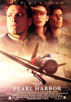
They both have different looks to capture a different type of audience. The type of font used in Pearl Harbor is small in comparison to the size of Rockys. It is placed at the bottom on the picture, which suggest that the characters in the film are very important, who are directly above the title. The font is bold which makes it look larger even though its small. The font is old looking and pointy to show that the film is from a true story, during the Second World War in 1944.
Rockys font is really big bold and striking. The size of the text captures your sight at first and makes you think what this film could be about. Then you read the caption about it, 'His whole life was a million-to-one shot', which makes you think what could this shot be. Without seeing the peoples faces on the cover, who're blackened out, you know the film is based around them, this creates an audience already as the cover is suspucious and you dont learn a lot about the story line from it.
No comments:
Post a Comment