
As i have analysed the different fonts used in both 'Pearl Harbour' and 'Rocky', i can see that there are both similarities and differences between the two. Pearl Harbour's font is more small and is very distinct. I feel it shows the picture is more important than the actual name of the film, as the picture is enlarged and the title is small and at the bottom. As there is two men and one woman in the picture i feel this may give out an idea that there may be little romance in the film. By looking at the clothes they are wearing you can see that this film may perhaps be based in the past, as their clothes are not as modern compared to nowadays clothing.
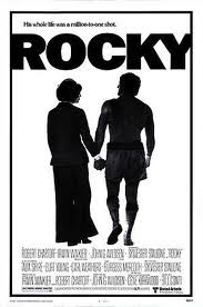
Furthermore, the font used in 'Rocky' is a lot bigger compared to 'Pearl Harbour'. It is bold and easy to see at the top centre of the page. It takes up all the space at the top of the cover. As there is a bold title and two people in the picture, you automatically feel the film is based all on Rocky. Similarities between the two are that they are both centred and they are both written straight on the cover, so they are easy to read. Differences between the two is that 'Pearl Harbour' is used in 'PALATINO' and 'Rocky' is used in 'COOPER BLACK'. Also, the size difference between the two are different as, 'Rocky' is bigger and 'Pearl Harbour' is smaller.
No comments:
Post a Comment